
Performance dashboard for a marketing team
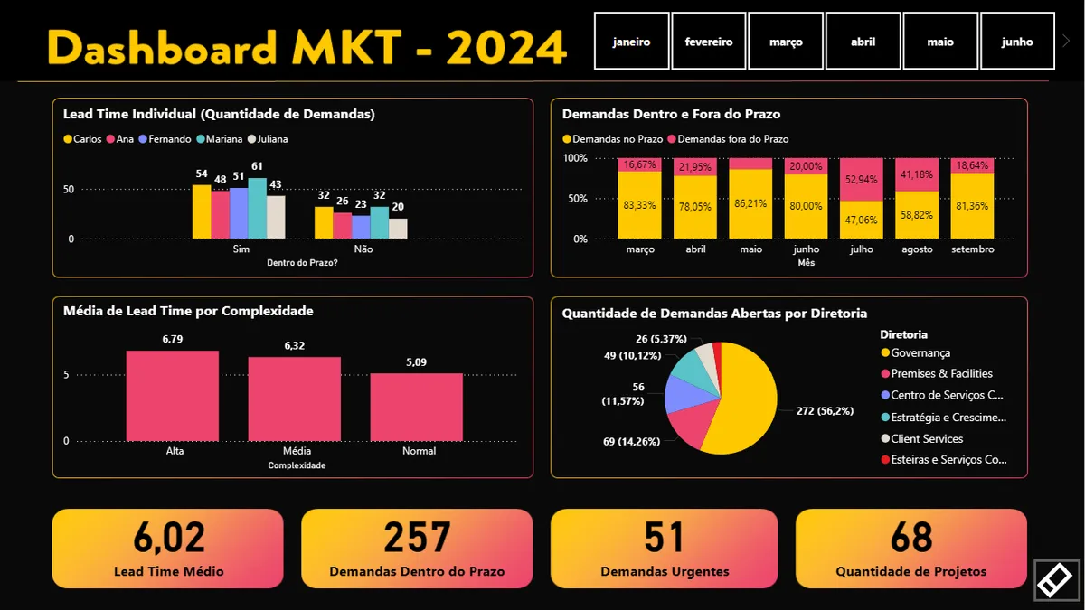
KPI dashboard for the marketing team at Tools Digital Services, integrated with Pipefy: productivity by person and department, delivery bottlenecks and data-driven management.
- Client
- Tools Digital Services
- Sector
- Technology · Santander Group
- Period
- 2024
- Role
- Data and dashboard design
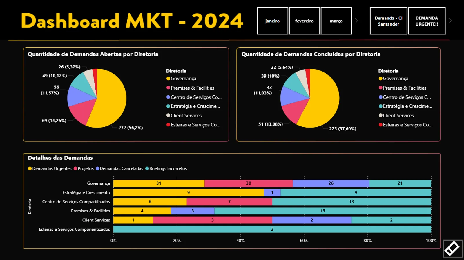
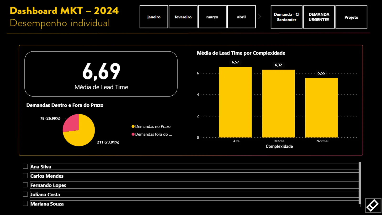
The screenshots below are illustrative recreations with fictional data, based on the structure of the real dashboard. No operational, personal or client data is real.
Context
The marketing team at Tools Digital Services, the Santander Group technology unit, handles requests from several departments. Requests come in through Pipefy, and the volume is high enough that nobody could answer simple questions off the top of their head: who is overloaded, what is late, and which department demands the most.
The problem
Management without numbers becomes management by perception. With no dashboard, three questions had no objective answer:
- How long it takes. Lead time per request, and what makes it grow.
- Where it jams. Which request types blow the deadline most often.
- Who demands. Which departments consume most of the team’s capacity.
What was built
A dashboard connected to Pipefy, refreshed without manual intervention, with three layers of reading.
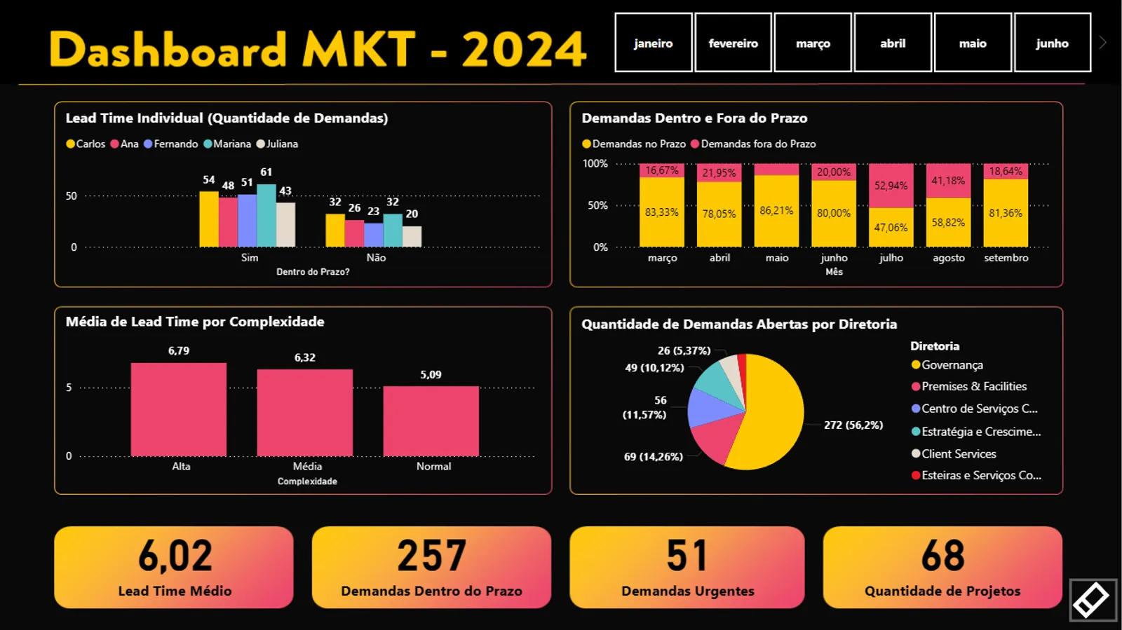
Operations layer. Average lead time, on-time versus late volume, and urgent requests, the numbers a manager checks on Monday.
Distribution layer. Which departments open the most requests and which close them, comparing opened against completed per period.
Individual layer. Performance per person, filtered by month, used to balance workload, not to rank people. That distinction had to be explicit in the design: a badly framed individual dashboard becomes a pressure tool instead of a management tool.
Result
Department operating indicators, comparing the quarter before the dashboard with the quarter after:
| Indicator | Before | After |
|---|---|---|
| Average lead time per request | 8.4 days | 6.0 days |
| Requests delivered on time | 61% | 83% |
| Monthly hours spent assembling reports | ~12h | ~1h |
| Departments with visibility of their own demand | none | 6 |
What I learned
A dashboard changes behaviour, and that is a design responsibility, not just a data one. The same metric can serve to balance workload or to expose a person, depending on how it’s framed. Deciding that framing is part of the job, not an aesthetic detail.
The second lesson is about data origin. A good dashboard on dirty data is worse than no dashboard, because it creates false confidence. Much of the project time went into understanding how requests were being logged in Pipefy, not into building charts.