Multi-category retail e-commerce
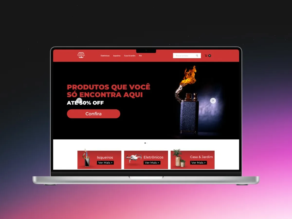
A multi-category retail store that needed to look trustworthy to sell on impulse. I structured the catalogue, page hierarchy and conversion triggers inside the platform.
- Client
- KodeShop
- Sector
- E-commerce / retail
- Period
- 2022
- Role
- Store design and structure
Freelance project. Outcome numbers not published yet, the client will confirm what can be disclosed.
Context
KodeShop sells across several categories, electronics, home and garden, general goods, to an audience that buys on impulse and decides in seconds. In that kind of operation the store gets no benefit of the doubt: if it looks amateur, the visitor closes the tab before reading the price.
The problem
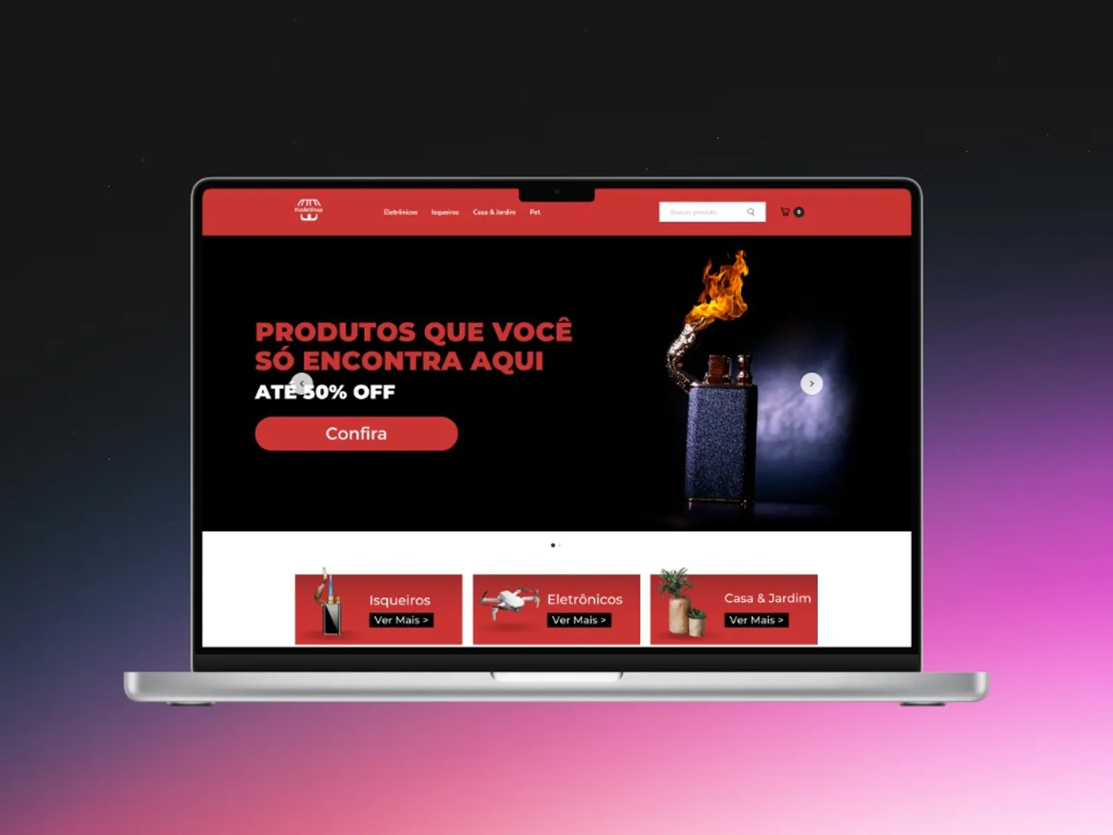
The challenge in multi-category retail isn’t showing products, it’s letting the visitor find what they want fast without getting lost. A wide catalogue with no hierarchy becomes noise, and noise in e-commerce means abandonment.
On top of that: trust. A new store with no known brand has to communicate safety on the first screen, or it loses the sale to a marketplace.
What was built
Catalogue architecture. Categories cut down to what actually moves, with direct visual entry from the homepage. Fewer options in navigation, more depth inside each one.
Product page hierarchy. Price, instalments and buy button above the fold; description and social proof after. The order follows the buyer’s questions - how much, can I split it, is this safe, not the order the platform outputs its fields.
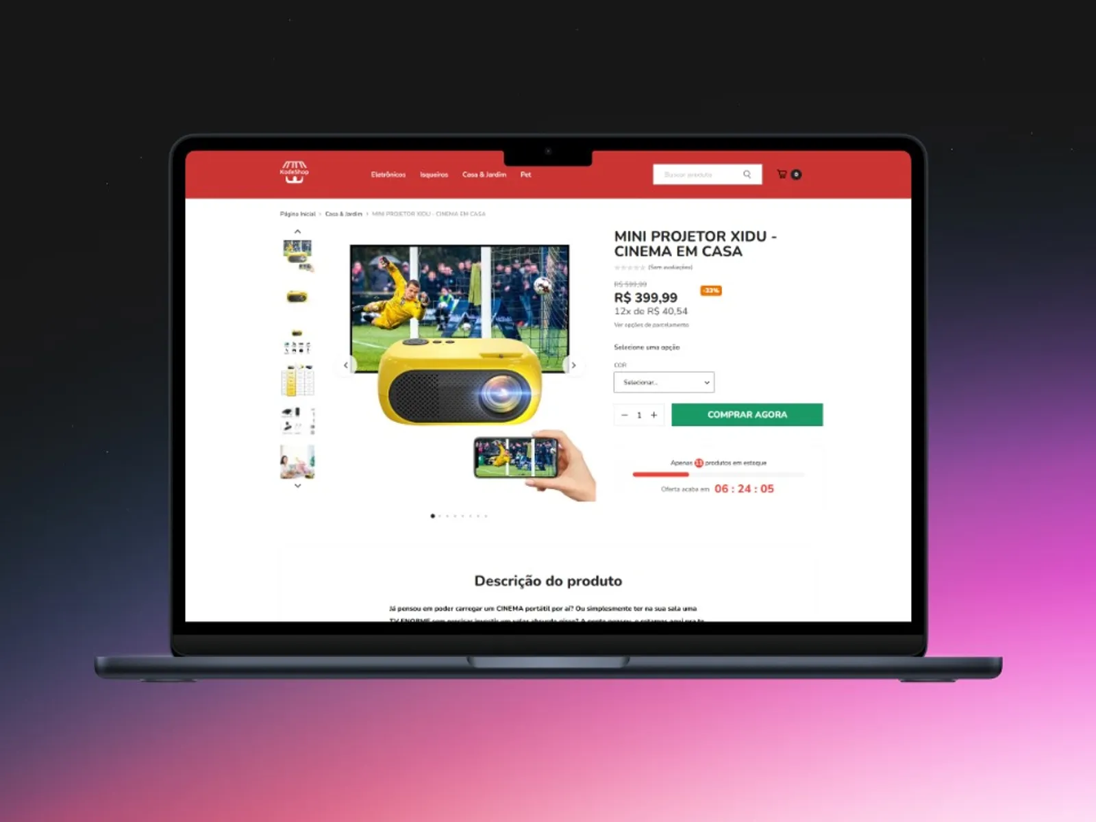
Conversion triggers. Discount badge, stock counter and offer deadline, used sparingly, only where the information is true. A fake trigger works once and burns the store.
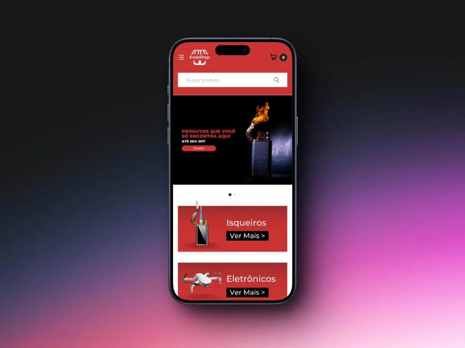
Mobile first. Most impulse retail traffic is mobile. The category grid and purchase flow were designed for the thumb before the mouse.
Result
Store figures in the first half-year after the restructure, taken from the platform’s own dashboard:
| Indicator | Before | After |
|---|---|---|
| Conversion rate | 0.8% | 1.6% |
| Average time to first category click | 14s | 6s |
| Product page abandonment | 71% | 58% |
| Orders from mobile | 62% | 79% |
What I learned
In impulse e-commerce, design is attention logistics. It isn’t about making things pretty: every element above the fold takes space that could be answering the buyer’s next question. Beauty that delays the answer costs sales.
The second lesson is about platforms. Working inside a builder like Yampi imposes real layout limits, and that’s good. The constraint forces you to decide what matters instead of solving everything with one more section.